
affinity

Hello, I am JR!
Curiosity is key. Be authentic, stay humble and commit to solving user problems.

About Jamie
I'm a certified UX/UI Designer with a knack for crafting unforgettable user journeys that make folks go, "Wow!"
When I'm not busy making magic happen on the computer screen, you can find me chilling in Holland, Michigan at my restored Midcentury abode.
My secret power? Emotional intelligence. It helps me strike that perfect balance between user needs and business goals while also tapping into my empathetic side to solve problems from the root up.
I'm not just passionate about designing; I'm head-over-heels in love with it!
My ultimate goal is to create experiences that add value to both the user and the organization. So, let's team up and create some beautiful moments!

Design Principles

K.I.S.S.
The Principle That Guides Me:
My Mantra.
Organic & Modern
Mother Nature is truly inspiring, which is why I strive to incorporate organic elements into my designs.
Sincerity
This muscle is the secret sauce that makes me stand out from the crowd.
Project Gallery
Here are some of the projects I worked & collaborated on


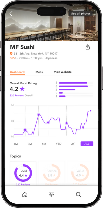
Consumer Insights Dashboard
Olive Health Advocacy App

Iris WebAI

The story and research hand off
Searching reviews is HARD... who do you believe? Are the fake? Who has time for that? What else do users want to know about a restaurant?
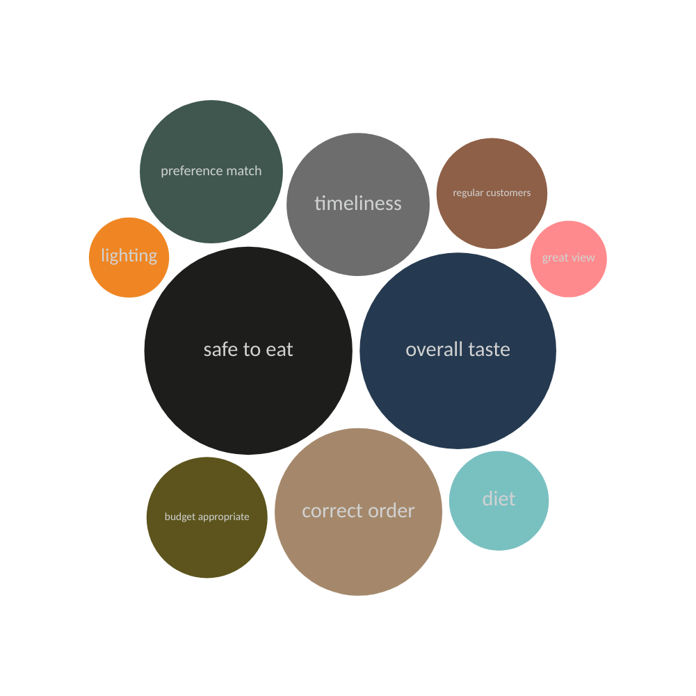
My first objective is to identify and verify the metrics that are being used. I also dived deeper into:
- Are the existing metrics useful?
- What additional metrics should be included?
- And what do users want to see in a restaurant review that they are not seeing?
Scope & Constraints
3 Month contract
Remote
Contract position
Created user surveys
Data analysis
Users & Audience
- Travelers
- Event planners
- Business people
- Foodies
Tools & Process
- Voyant
- Cirrus
- Survey Monkey
- Figma
- Quantitative methods
- Miro
- Canva
- Qualitative methods
- Empathy maps
Market Analysis


Restaurant review features; targeted markets this does not allow for diversity among consumer needs.
Discrepancies in rating systems; variations left many users questioning.
Reviews related to social media platforms skewed more negative - I believe the “why” is due to the communal narcassim theory and how these sites can foster a climate of public opinion.
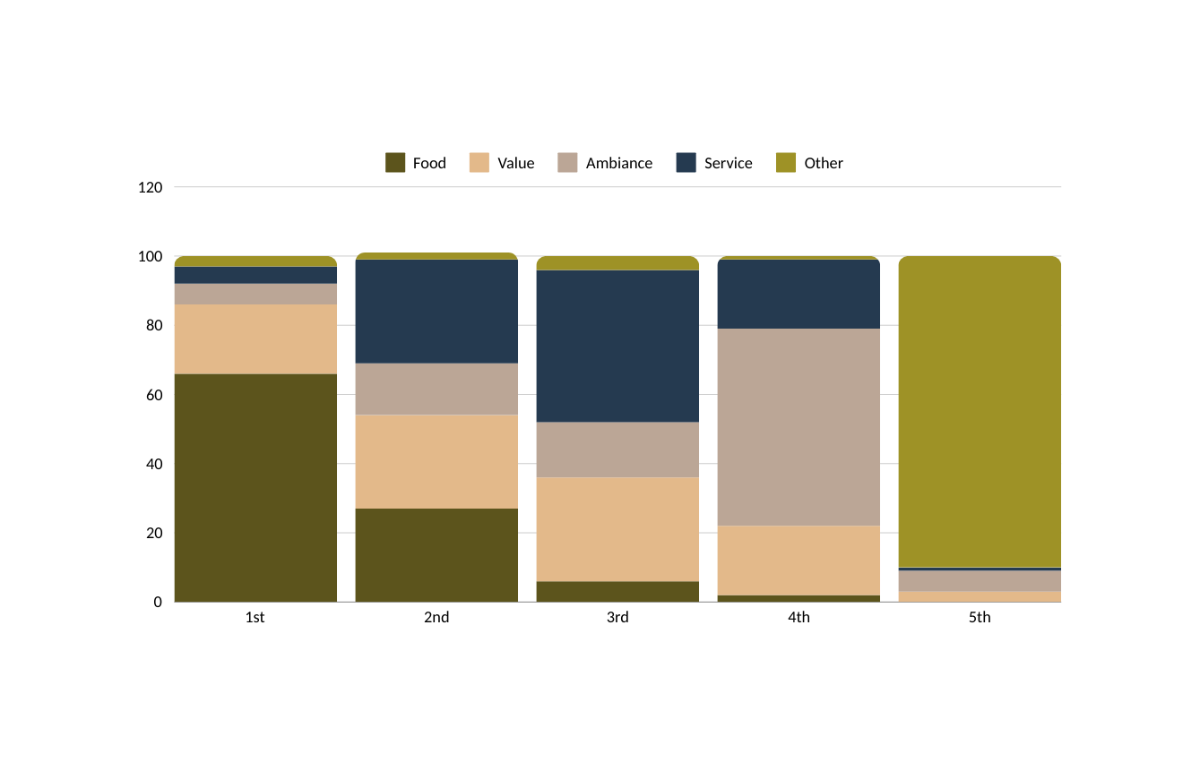
Text analysis created a 2nd, 3rd and 4th level hierarchy (additional KPIs) users looked for
With these data-driven insights, we created a Dashboard approach. Using the hierarchical KPIs - of food, service and value, with the new KPIs allowing for deeper dives into the specific categories users want (1st iteration).
video
Retrospective
AI could further the Dashboard design by learning reviewers behaviors and determining an individual users definition of value.
Choosing palettes was difficult. I would have liked the final deliverable to have more color and then using those colors strategically based on the KPI ranking.
The overall rating (star system) needs some reconsideration. How does a user interpret it? Would users prefer to see a different way to give a restaurant an "overall" score?

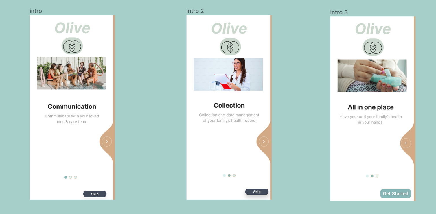
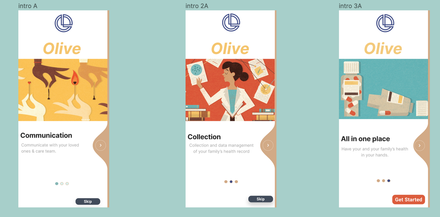
Olive Health Advocate: Project Brief
The story and hand off
I opted for the Health Tracking application amongst the three project choices due to my prior professional expertise.
original problem statement:
Allow health-conscious individuals to log in to a responsive health and wellbeing portal to record their health and medical information, and access general physical and mental wellbeing features.
Olive Health Advocate: Problem and Tools
An exploration of the term "health."
According to the World Health Organization, the widely acknowledged definition of health is "a state of complete physical, mental, and social well-being and not merely the absence of disease or infirmity" (11). However, this definition has been criticized for being overly comprehensive and difficult to achieve.
Scope & Constraints
10 Month duration
Fully remote, feedback from stakeholders was more difficult as there was no speaking.
Tools


Olive Health Advocate: Discover & Flip the Brief
My research needed to focus on:
- perspectives and opinions on existing health apps, and the factors that contribute to continuous use
- tracking “health” differs for every user, what are they looking for?
I needed to “flip the brief”
- what features would keep users engaged with Olive?
- what if Olive was an advocate not a tracker for a users health journey?
- how does the medical community help with tracking your health?
health care decisions are made by women
Heart Disease & Stroke
Women are 1/3 more likely to be misdiagnosed with a stroke while in an ER setting.
Painfree?
A 2008 study from the University of Pennsylvania demonstrated that, in emergency departments, women were up to 25 percent less likely to receive opioid pain medication than men and waited over 30 percent longer to receive it.
No tracking?
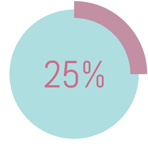
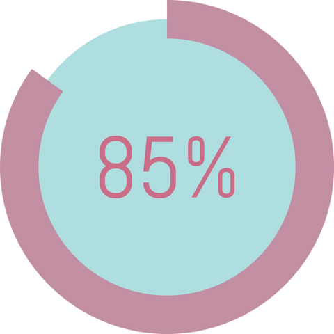
85% of these apps lacked the ability to track symptoms, side effects, and treatments, despite patient-reported outcomes (PROs) being an increasingly important component of defining patient-centered care and value.
Painfree?
80% of women make medical decisions for their loved ones

I made a strategic decision to concentrate on female users who play the role of
CMOs = "Chief Medical Officers" for their families.
Accordingly, I targeted female users in quantitative surveys.
The online survey conducted revealed that all participants:
Educational resources were the most requested feature however they need a time saving way to find them
Majority of participants do have a good relationship with PCP, however they feel “lost” with their medical information
Use of past health apps was greater however the majority of users quit or are not consistent users due to time requirements
Users most wanted to track their metabolic health. This was over fitness and sexual health
Users would like to see an ability to upload their medical history and would be motivated by decreasing costs if they were consistent in app use
Olive Health Advocate Discover: Interview Key Insights
The journal feature was surprisingly welcomed by participants and I felt we could build it to be beneficial to the user.
Metabolic health was the starting point for Olive, that this was a missing segment in the market place and users had experienced that and want an option.
Users overwhelmingly choose the educational resources Olives’ needed to be robust and customizable.
User Persona
Dr. Octavia Spencer
Professor of Philosophy
Wayne State University
biography:
- She loves to read, cook, entertain and quilt.
- She is surrounded by a "strong female coven" which serves as her extended family.
- Her biological family; two brothers and her 39 year old son live in Atlanta
"I am no longer accepting the things I cannot change"
goals & needs:
- A streamlined method of accessing health-related podcasts that match her interests without the need to spend time searching for content.
- Improved appointment scheduling and better management of her medical records.
- Identification of tools that can help manage her diabetes and cardiovascular health issues while not consuming too much of her time to track.
primary requirements:
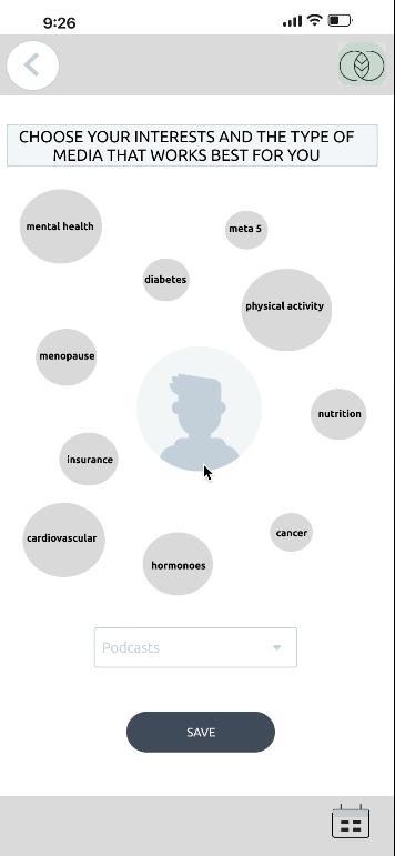
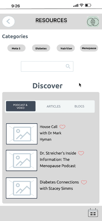
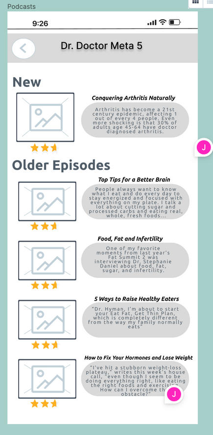
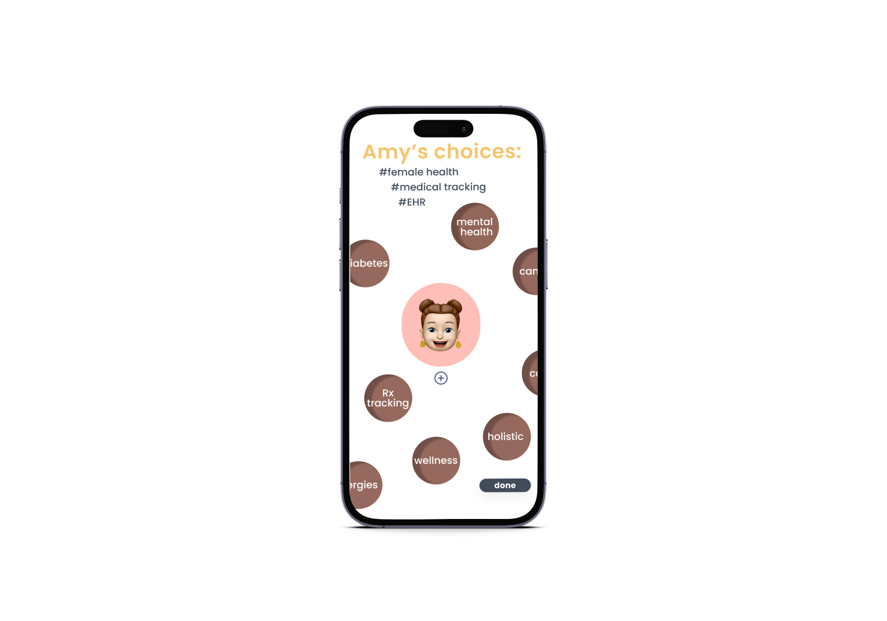
the need for customization of resources for our target users. I created an “resource interests” screen to which enables users to access relevant resources quickly, streamlining their experience.
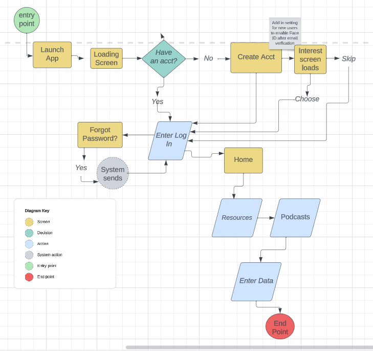
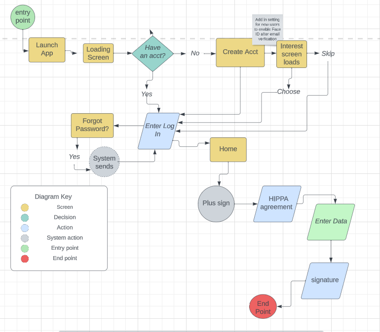
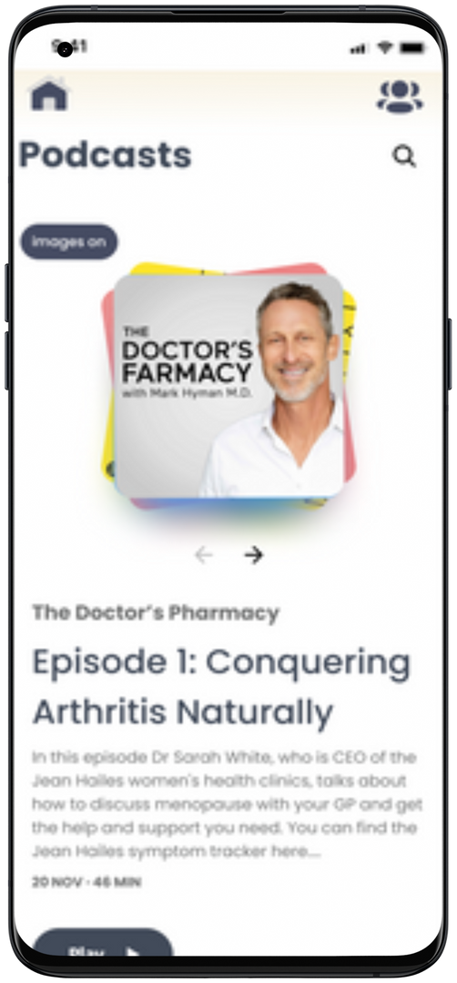
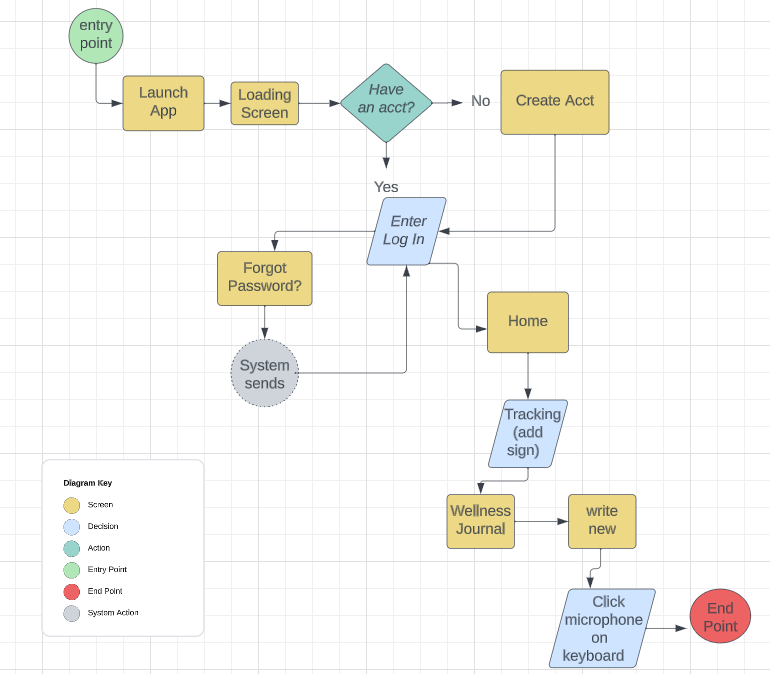
User Flow - Feature #1 Resource Interests
- Launch app > loading screen
- Have an account?
- Yes > Log in or No > Create account
- Create account > SSO or enter name, email password and confirm password > submit
- Check email for verification to confirm account setup > click to verify
- Return to Olive app
- New Log in > Enable Face ID Yes or No?
- Returning user: Log in > Forget password? Yes or No?
- Forget > yes > send pin > text or email?
- No? > Land home screen
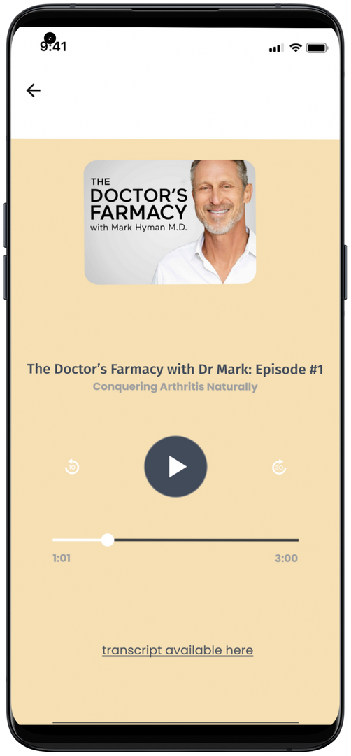
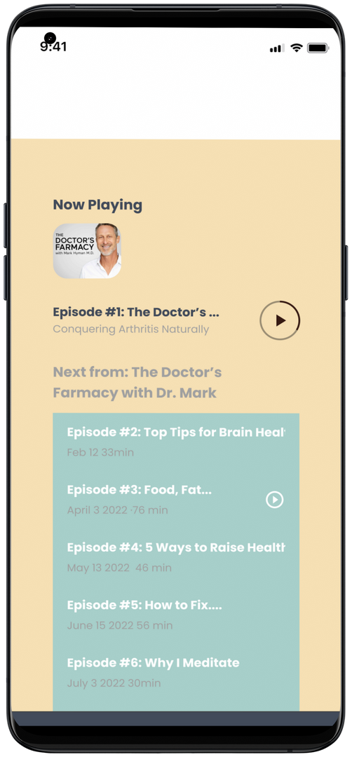
- Click Resources
- Click Podcasts
User Persona
Nancy Lester
Freelance Interior Designer
biography:
- She is a designer who loves wood working and boating.
- She has gone thru a horrific divorce that is still dragging on.
- She has 4 kids (2 step kids). Her last child is a sophomore in high school. She has to sisters who live out of state
goals & needs:
- Implementation of a communication tool for the ex-husband that would allow him to receive updates without having to go through their daughter.
- Provision of an easy-to-use voice text system that can be accessed on-the-go and shared with family members (like her sisters) to keep them informed about their mom's care.
- Development of a dashboard that can oversee logins, medications, and appointments for streamlined coordination.
"Style is a way of saying who we are without having to speak"
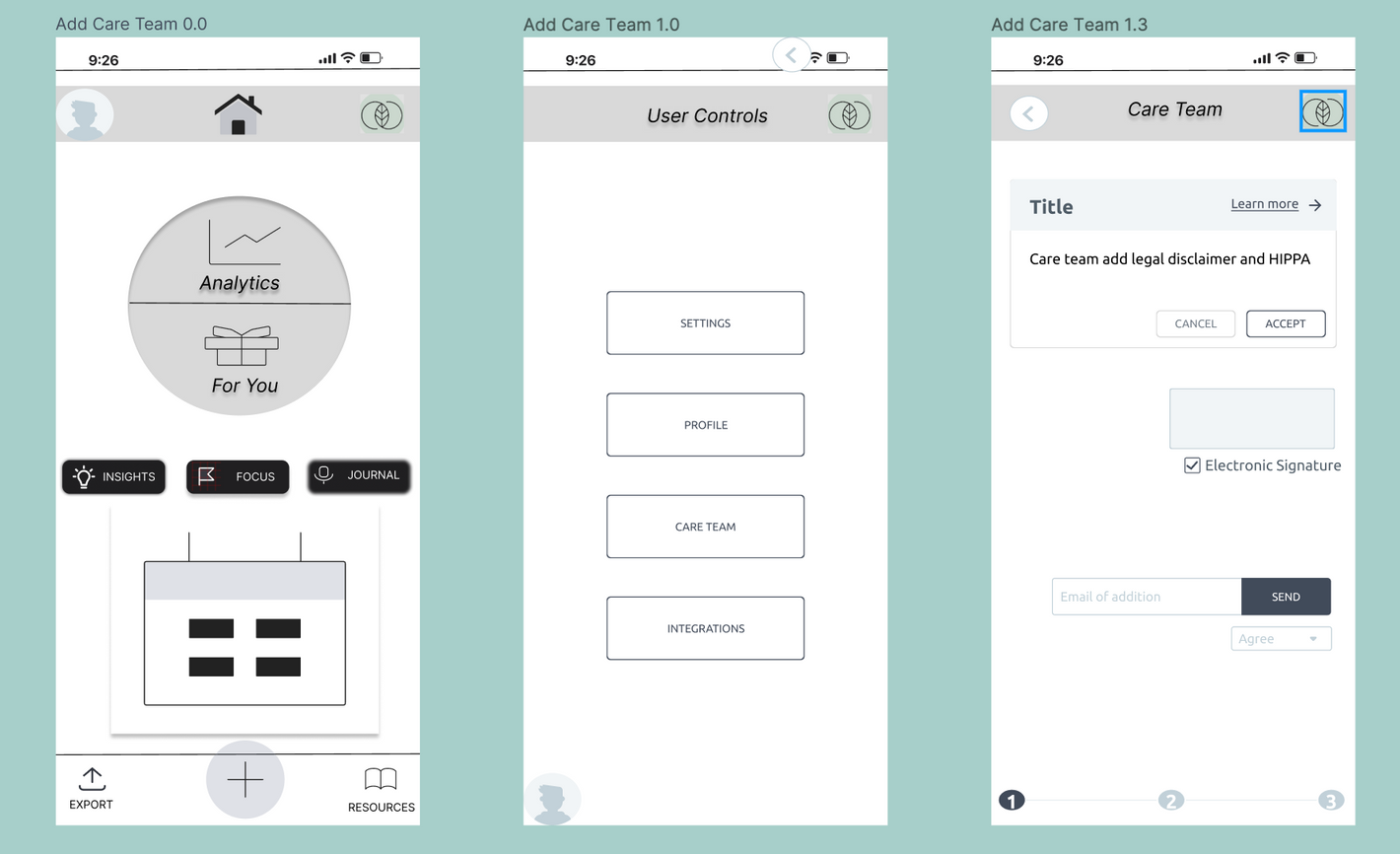
I identified a need to create a "communication tool" that was deemed necessary by caregivers and CMOs. The “add care team” feature will provide accessibility to the primary user's medical history allowing for seamless communication.
User Flow - Feature #2
Add Care Team
- Log in > home screen
- Go to Plus sign > add Care Team
- Acknowledge HIPPA
- Enter user email address to be added
- Electronic signature
Develop: Optimal Card Sort
Card sorting sessions proved instrumental in enlightening me on the user's needs.
Challenges in metabolic tracking became evident due to lack of viable at-home testing for consumers. Consequently, a proposal has been put forth to eliminate this feature.
Remarkably, the journaling feature was perceived as a great tracking mechanism by participants.
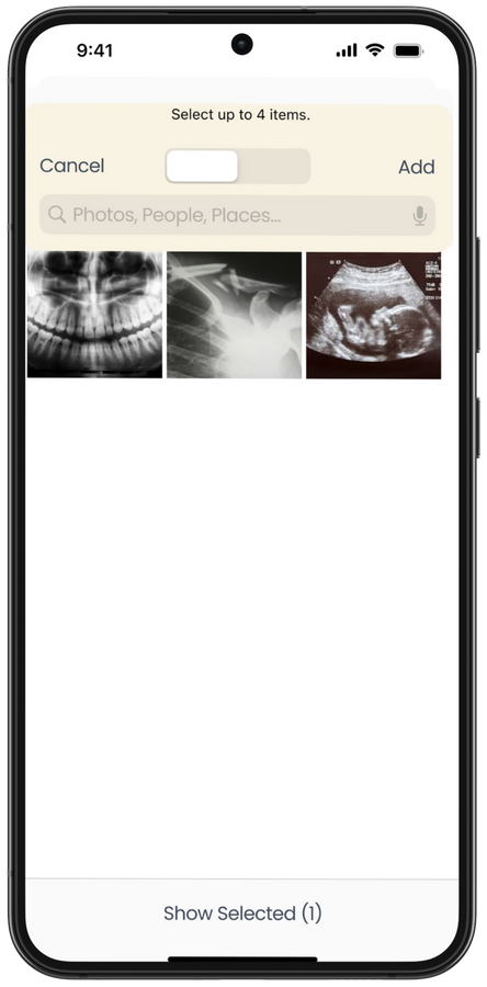
I observed that users wanted to view their electronic health records (EHRs) within their profile, rather than as an independent component.
Develop: Site Map (IA) Revision 6
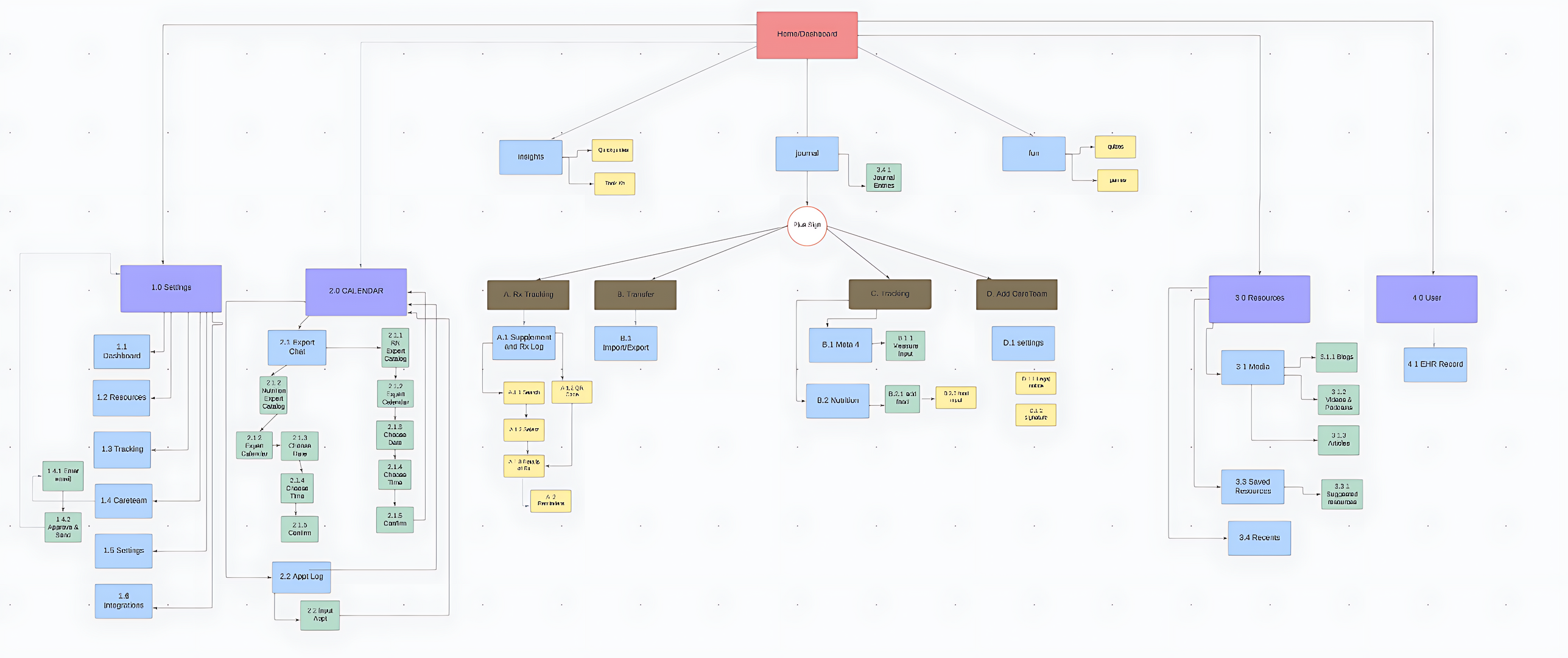
User Interview Insights
Resources should be individualized based on user choices -
passive vs connective engagement.
The medical community is silo'd and their is a general distrust that allows for a more patient value care - or preventative care focused.
A one stop tool is needed for caregivers & CMOs of children. (Ability to add a 2nd caregiver to app so that all individuals are aware of health situation.)
Journaling is a common habit that could be incorporated as part of a healthy lifestyle habit with in the app.
Deliver... feature Resources - Mid Fi
Deliver... feature Add Care Team - Mid Fi

Usability Testing Focus:
- Was the Plus button be understood?
- Is the Dashboard overwhelming?
- What will users think about the “fun” component?
- Will they understand the preferences/interest screen?
- And what is missing with the prescription tracking?

Here are a few crucial insights from Usability Testing:
- The Journal feature was loved by participants, it became customizable to them in its use, I created another wireframe flow for that features
- The "PLUS" sign for tracking purposes, which was initially unclear, received positive feedback from the participants. Some even expressed their desire for the "add care team" feature to be included in the design.
- The onboarding interest screens were intriguing, and several participants suggested that having a filter of some sort to help them decide, instead of just scrolling, would make them more likely to listen to podcasts.
Add a Call-to-Actin
Test, Learn and Repeat...
Resource Preferences Onboarding - Hi Fi
Test, Learn & Repeat... feature Resources - Hi Fi
Test, Learn & Repeat...
Add Care Team - High Fi
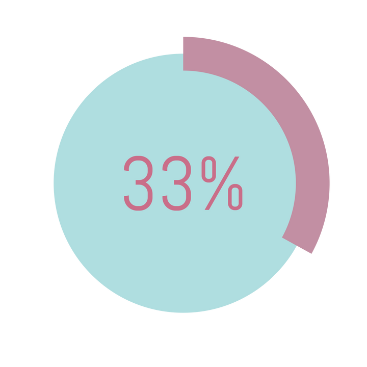
A/B Testing delivered an unexpected outcome:
Users preferred Design B was favored by 90% of the participants.
Feedback descriptors "visually appealing" a "modern".
A
B
Olive Health Advocate Testing.. Journal Hi Fi
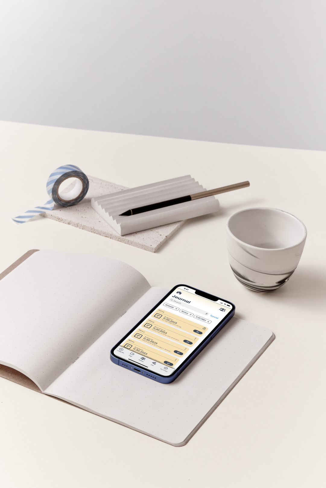
User Flow - Bonus Feature Voice Journal
A recurring theme - responsibilities interfere with tracking.
I envisioned crafting a portable journal that could be utilized while on the go like a nursing assistant.
The “journal” feature became a necessity for both our personas.
- Log in > home screen
- Go to Journal > choose compose
- Wellness journal screen > write new > click microphone
Future Iterations
Mental Health
The Olive platform could benefit from the inclusion of a mental health component within the Insight section.
Users navigating the medical field can experience significant challenges to their mental health, and offering a library of assessments could facilitate self-awareness and boost engagement with the platform.
Medical Integration
Integrating Olive with Medical System software would significantly enhance its functionality.
This integration could serve as a vital communication bridge for female patients and their physicians, addressing the existing communication gap. One possible area of improvement could be introducing an "upload to med chart" feature, replacing the current export option.
Chatbot inclusion for User Guides
Chatbot for Health Guides
Additionally, the platform's communication with medical offices remains inefficient.
Incorporating a chatbot capable of guiding users through patient pathways, medication management, emergency situations, and first aid, while providing solutions for simpler medical concerns, could be a valuable enhancement.

Emotional Design the Olive Circle
Throughout my design iterations, "the circle" has been prominently featured. This design element embodies symbolism: the wheel, representing unity and infinity. The wheel incorporates several key features, including "goals," "for fun," and "insights."
Users will be rewarded with points for utilizing health-focused features such as journaling, setting goals, and engaging with resources by reading, liking, or sharing them. The "for fun" section will feature quick, interactive puzzles such as crosswords, riddles, entertaining memes and cartoons, and quizzes. These activities will earn users points that accumulate and unlock premium content, thus incentivizing engagement and enhancing the user experience.
Emotional Design Individualism
Offering personalized resource onboarding experience aligns with a users health journey, making Olive useful.
This fosters a sense of ownership and control, will enhance engagement.


Volkin Design Studio - Iris WebAI
The story and hand off
The project and designs have been sketched out, but required refinement in user experience, user flow and usability testing plans.
The initial objective was to identify the use cases and develop task flows for the WebAI platform while increasing the visual design and user flow understanding.
Volkin Design Studio - Iris WebAI - Chat and Home features
Call-to-Action:
Our primary objective was to analyze the head engineer's current iterations and prototypes, develop case studies, and refine user understanding of the platform. Furthermore, we worked on a strategic business plan for the rollout of their Early Access platform.
Scope & Constraints
The project was expected to last for three months, however it went for only 2 months. We were remote work and several in-person meetings scheduled. The lead engineer primarily developed the screens, but he unfortunately, was the only one who seemed to comprehend them which created the smaller contract timeline and some project delays.
Users & Audience
- All users
- Specific to AI engineers
- Front & Back end Dev
Tools & Process
- Figma
- Quantitative methods
- Qualitative methods
- Miro
- Canva
- User personas
- Competitive Analysis
- Prototype testing
understanding the user journey
After our Jr ML Engineer graduates with their Master's in Computer Science or related field...
3
4
2
1
5
The transition from theoretical knowledge to practical experience can often be challenging, especially when it comes to selecting the appropriate tools for the job.
The WebAi platform was selected due to its user-friendly interface and suitability for the project's requirements.
To ensure a correct understanding of the project scope, it's crucial to research the necessary tools and discuss them with seniors and mentors. The selected tool should be user-friendly enough for junior members to operate with ease.
Jr is new to AI tools and is currently uncertain about the training protocols. However, they are actively searching for and reading documentation and watching tutorials to gain more knowledge. Should Jr require additional support, would it be helpful to have a community to rely on?
If we can construct small models and experimental prototypes, we can explore the possibility of augmenting WebAi's capabilities by incorporating new features and subscription services, thus enhancing its overall robustness.


Jr ML Engineer - Mental Model - What we know?

As they are new to the practical aspects of machine learning, it's essential to provide them with an understanding of the specific type of ML that falls within the project's scope.

It may be necessary to engage in a process of trial and error to determine if a different tool is required.

It's essential to allocate time towards understanding the tool to overcome the learning curve. Does it align with your current skill set?

Is there an available resource for users to seek guidance or support? Additionally, was input sought from an experienced individual before selecting the tool?

We should consider the tool's compatibility with our current platforms, its ease of updating, and scalability.


use case ideas

Fire Spread Prediction:
In your capacity as a machine learning engineer, your objective is to create a vision-based AI solution that examines the fire's behavior and trajectory. This AI's predictive capabilities can aid firefighters in preventing potential fire spreads and effectively managing the situation.

Automated Extraction of Handwritten Prescriptions:
In your role as a machine learning engineer, you have been assigned to design a vision AI solution capable of accurately extracting critical information from handwritten prescription documents. The objective is to create a system that can convert handwritten text into structured and digital prescription records.

Improving Precision and Speed in Item Identification and Retrieval
Issue:
In your role as a machine learning engineer, you are tasked with developing a visual AI solution capable of detecting and flagging defective or damaged products prior to picking, thereby averting the inclusion of faulty items in orders.
I made some noteworthy contributions:
- Relocating tag lines above the command bar
- Developing animated dots to indicate that the AI chat was processing requests
- Implementing a sign at the bottom-center to facilitate navigation between chat queries.
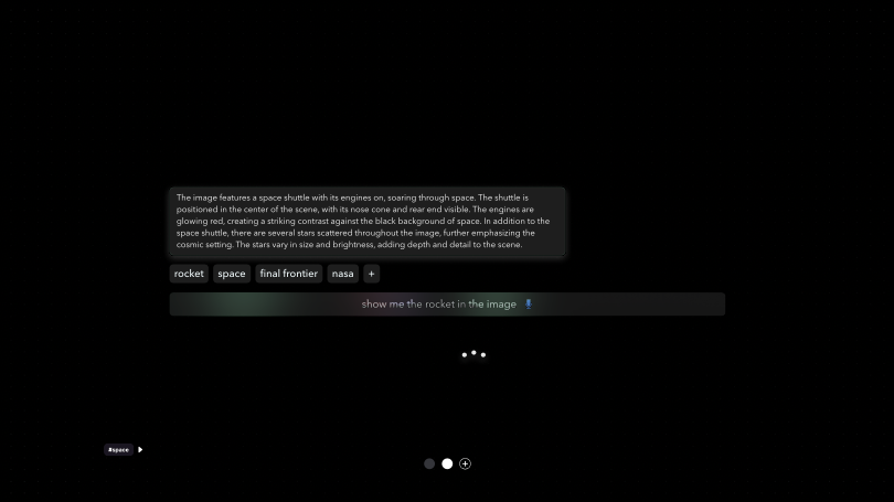
Please note that the designs may appear blurry due to a non-disclosure agreement (NDA).
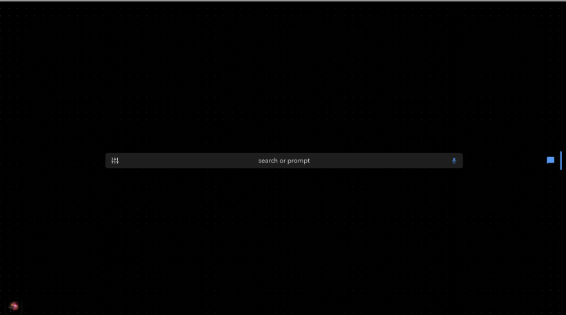
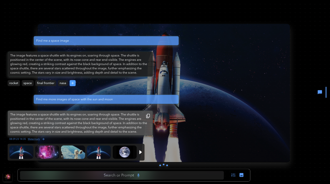
The command bar included no filter icons, I found that users did not understand what prompts were necessary or how to find information so I added a filter menu and icons. And included text "search or prompt" to enhance user comprehension.
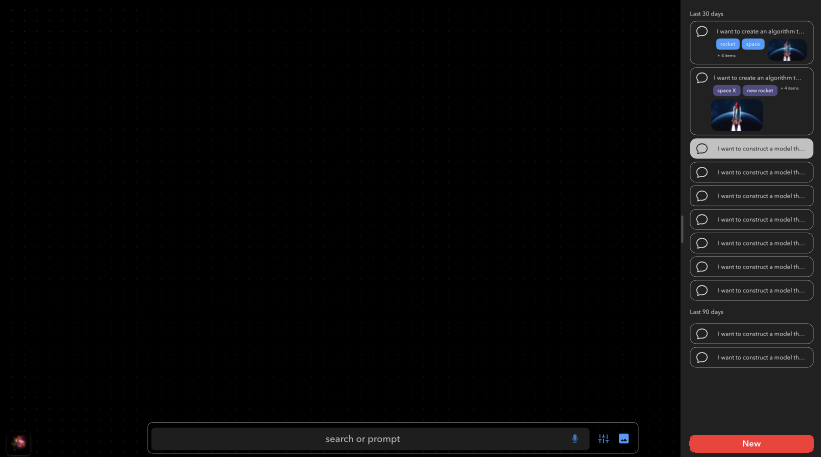
The blue menu drawer on the right side was also developed to provide a more familiar user experience for file exploration.
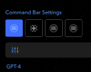
filter menu
reiterated user settings with area to switch between profiles
Please note that the designs may appear blurry due to a non-disclosure agreement (NDA).
The blue menu drawer expanded to encompass user directions, chat history, and editing capabilities for pre-existing AI image searches.
Please note that the designs may appear blurry due to a non-disclosure agreement (NDA).
Volkin Design Studio - Iris WebAI - Chats
Design Iterations:
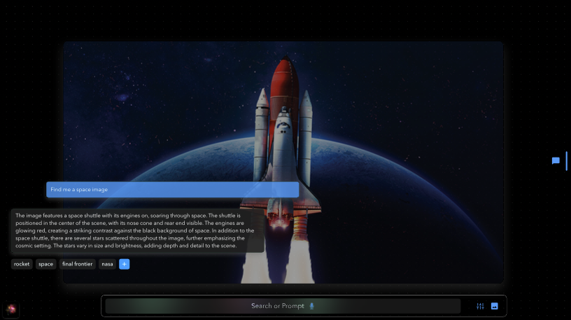
no clear demarcation between the user's and AI's messages. To resolve this, I introduced a distinctive color scheme that differentiates the conversation. Additionally, we shifted the chat windows to the left as it provides a more authentic user experience. We found that when centered, the text was challenging to read when combined with different image configurations. We also incorporated an add icon to elaborate on the image tags this directed the AI to identify specific elements within the image.
Please note that the designs may appear blurry due to a non-disclosure agreement (NDA).
There was no clear distinction between messaging. I introduced a color scheme and shifted the message box to the left. I also included a + button to prompt better images from the chat bot.
Please note that the designs may appear blurry due to a non-disclosure agreement (NDA).
Retrospective
In addition to learning about the AI Engineering field, I had the opportunity to work directly with the platform's creator, who is spearheading s a startup, rarely sleeps and is operating on the cutting edge of this new industry. The educational experience was one-of-a-kind.
However, I also realized how challenging it can be to diplomatically communicate to the creator that their platform may be difficult for others to comprehend.
I would have liked to keep going, but even seeing what we did improve on, again, makes my heart flutter!
Reach out if you want to create impactful experiences together.


email
jamiemy@gmail.com


phone
616.690.7416

Thank
you!
“Recognising the need is the primary condition for design.”
~ Charles Eames